WHAT IS IT?
A mobile application focused on the individual budget needs of both working and non-working college students.
PURPOSE QUESTION
How can we design a stress-relieving budgeting app that caters to both working and non-working college students, providing personalized budgeting plans based on their individual schedules?
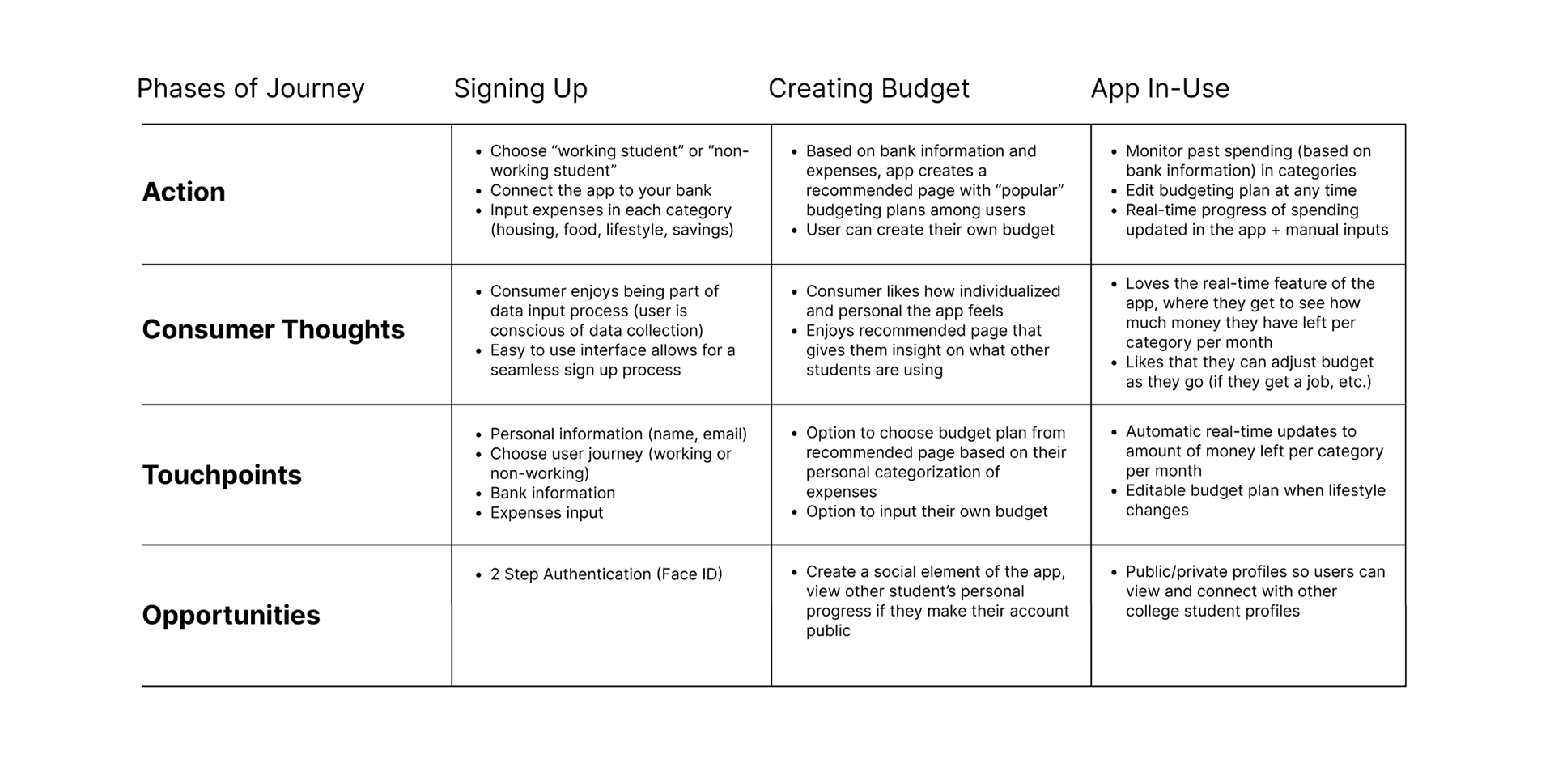
JOURNEY MAP
In order to understand how a college student might interact and benefit from a catered budgeting app, I mapped out different user journeys.
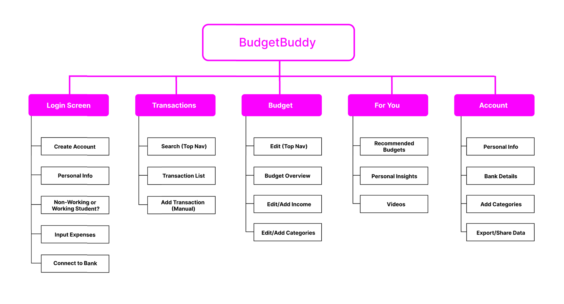
INFORMATION ARCHITECTURE
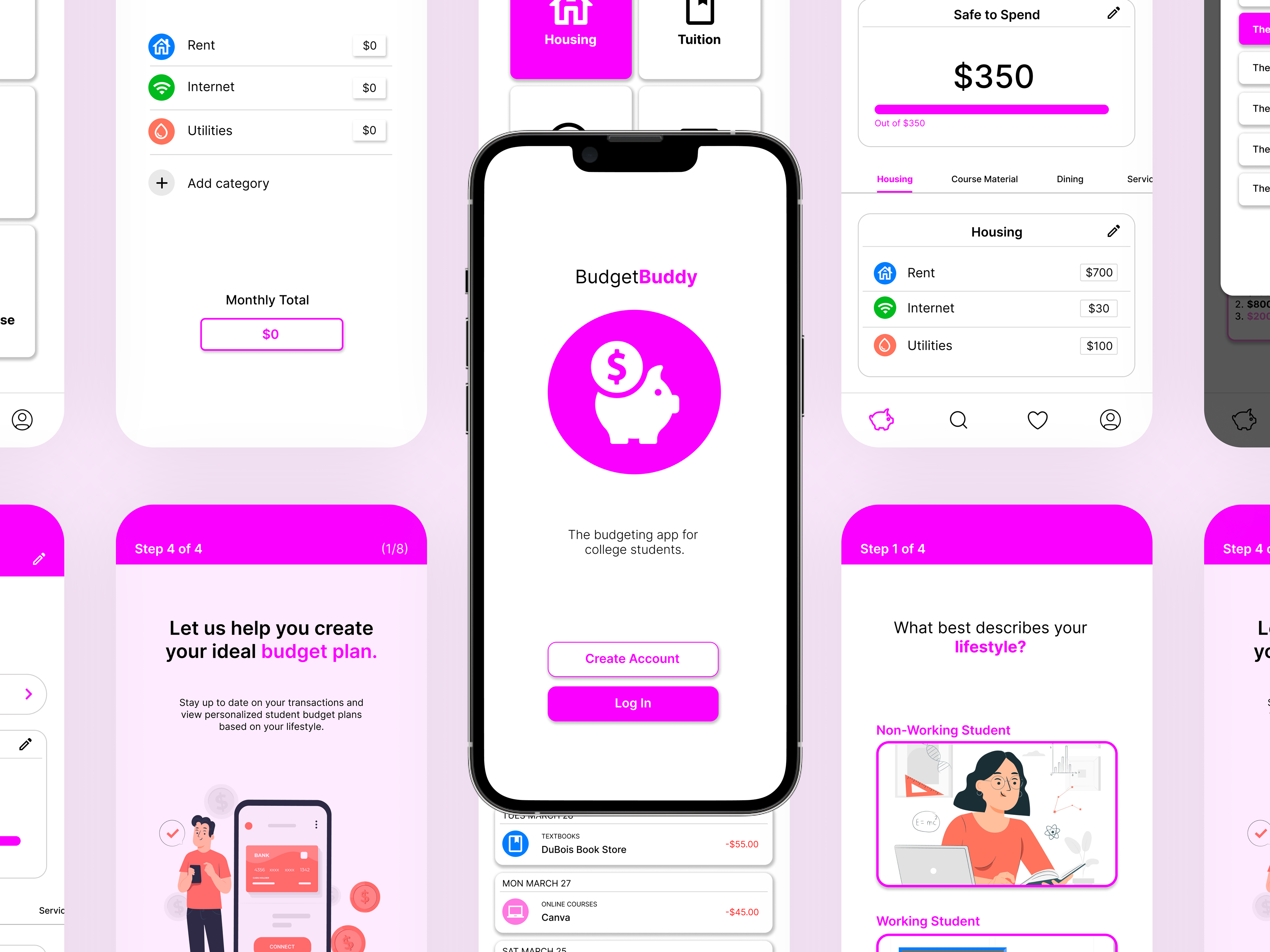
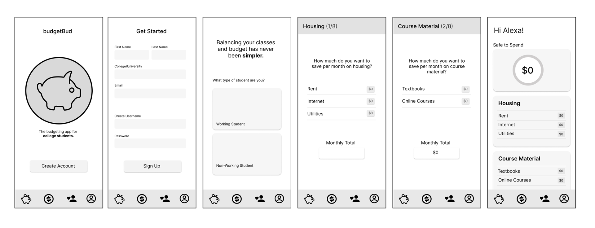
Based on user insight, the navigation of the app will consist of an onboarding flow, a transactions section, a "daily budget" home screen, a "for you" page of recommended budgets, and a profile section.
INITIAL SKETCHING
Using the information architecture, i was able to visually lay out the system of screens that would be necessary to make my app successful in catering to the budgeting needs of college students.
MOOD BOARDS
Building on my initial sketches and grayscale wireframes, I began exploring various UI/UX systems with the goal of making the app feel approachable.
Since money can often carry a stressful connotation, especially for college students, I considered two visual directions: muted cool tones to create a calming effect, or bright, high-contrast colors to bring an energetic yet friendly feel that would resonate with a younger audience.
DEVELOPING A SYSTEM
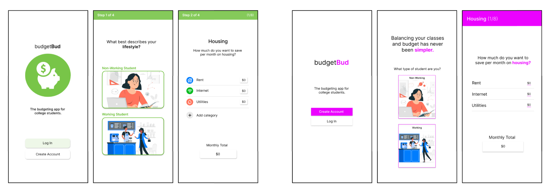
After user testing, I realized that budgeting needs a level of focus that a calm, muted UI wouldn't provide.
I worked with a few bolder, high-contrast color palette options to create of urgency and reflect the vulnerability that comes with financial decisions. This also helped the app stand out since most budgeting apps I benchmarked rely heavily on blue or red color schemes.
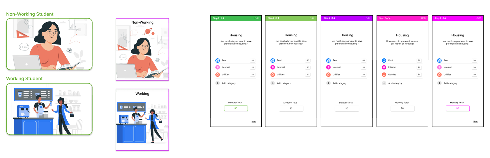
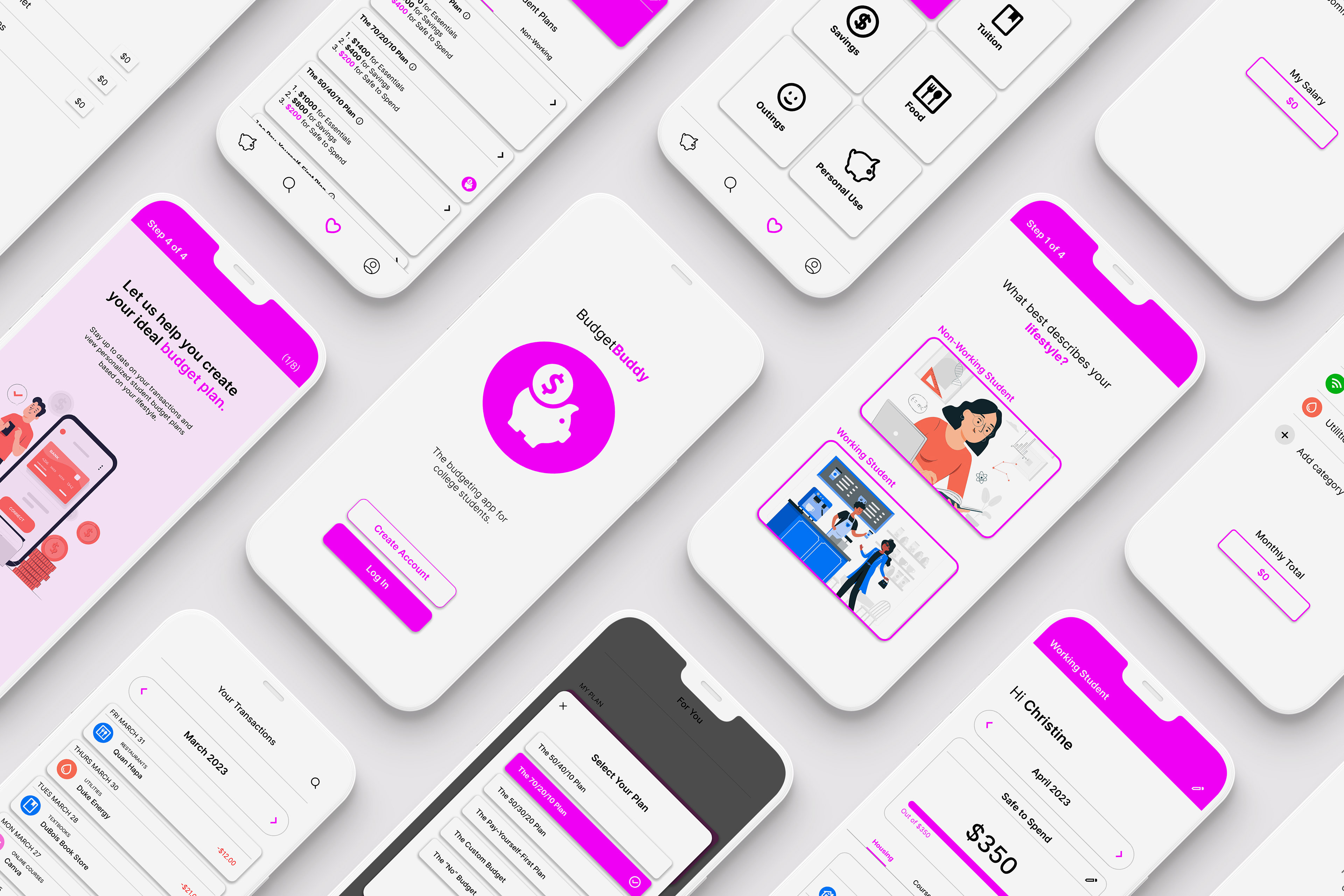
STYLE GUIDE
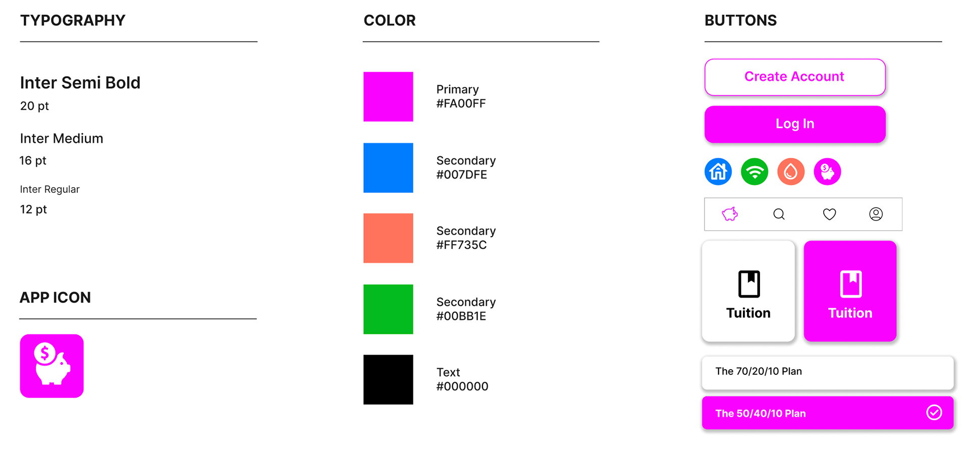
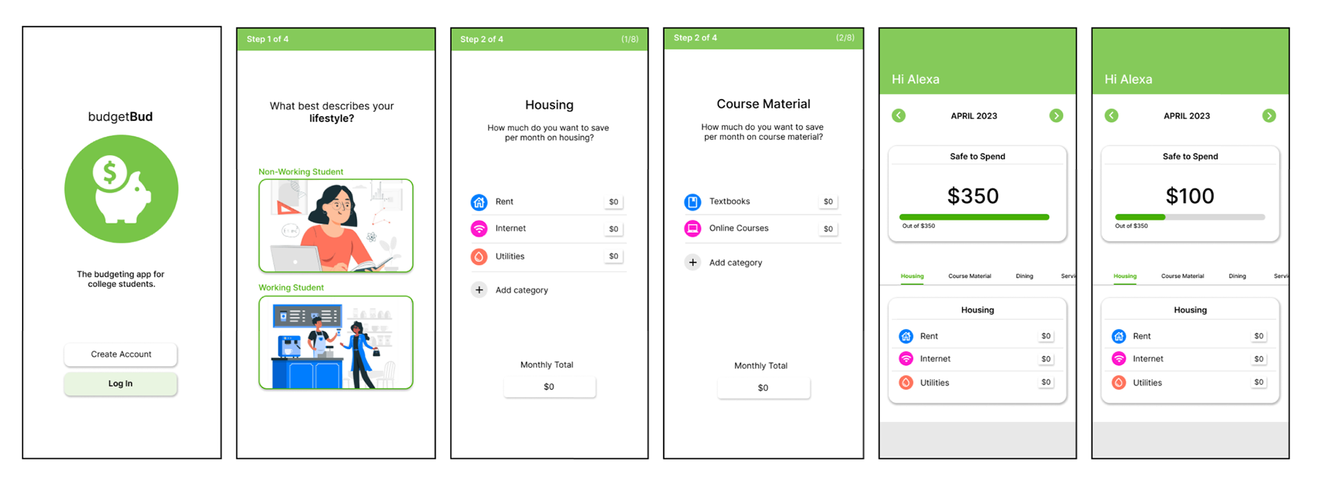
After a round of user testing, I chose to implement a rounder widget system paired with a bold magenta palette. The softer, rounded elements create a more approachable and user-friendly interface, while the magenta injects energy and draws focus to key interactions. From a design perspective magenta strikes a balance between warmth and vibrancy, helping convey creativity and urgency without feeling harsh.
It also differentiates the app from competitors, as most rely on predictable blues or reds, making the visual identity more distinct and memorable.